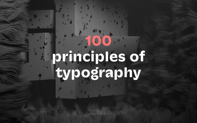
Why have we created the lo-ol studio?
Typically the presentation of a typographic project is highly codified and follows something of a traditional format, but for our typefolio we have decided to embrace a more diversified approach. We have gathered together a wide range of projects, from commissioned brand identities to logo expansion, from prototypes to variable fonts and revivals – and everything in between. As such, lo-ol.design acts as a window onto our daily activity.
I'd like to tell you a little about the journey we've been on with the website, and through that share with you our latest thoughts on type design, scripts, and variable font …
Where it started
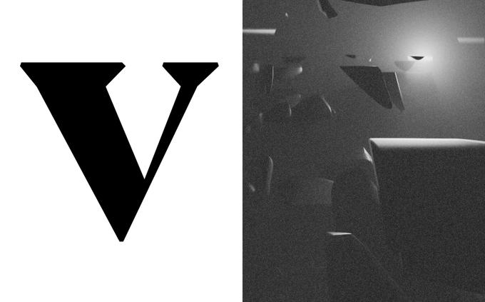
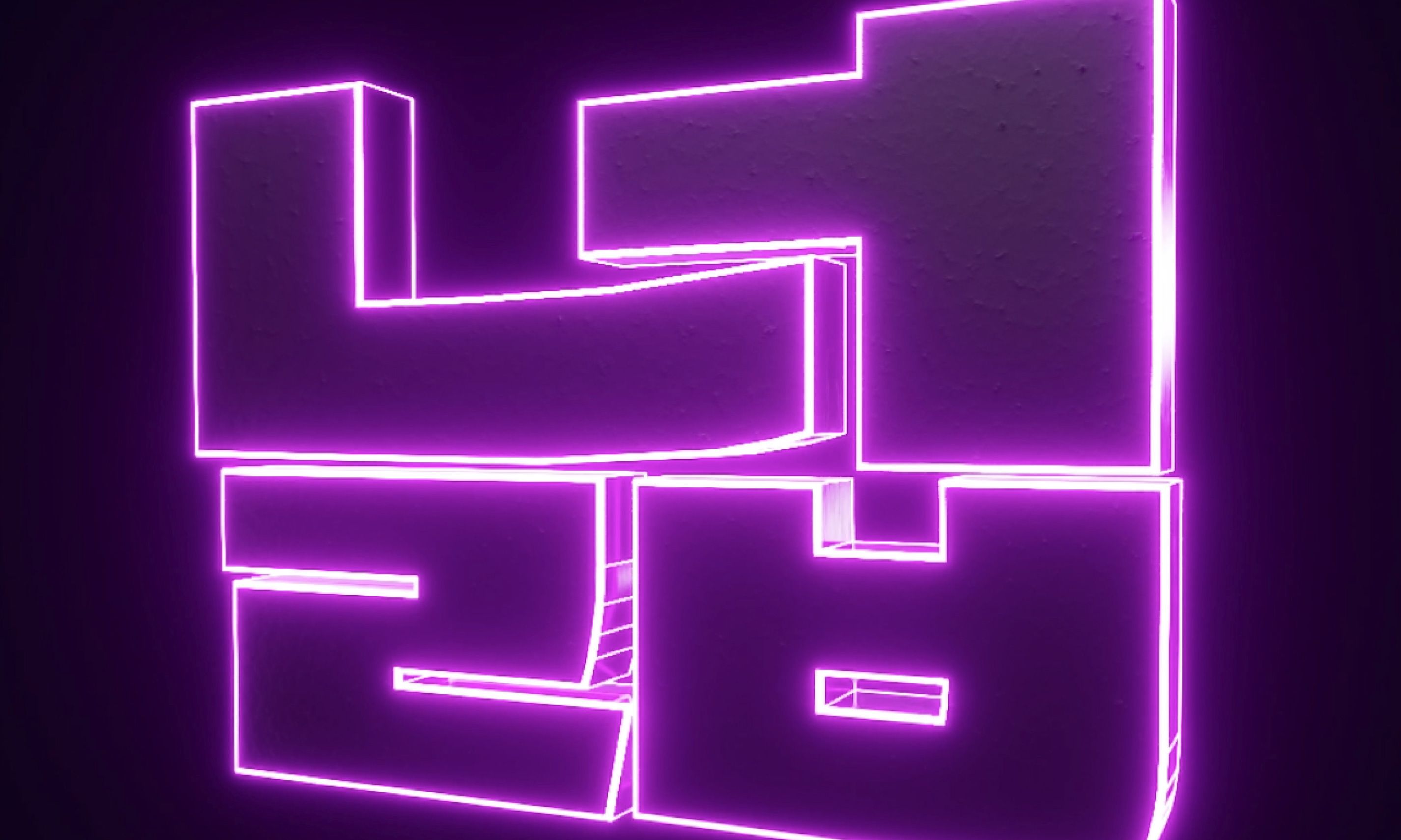
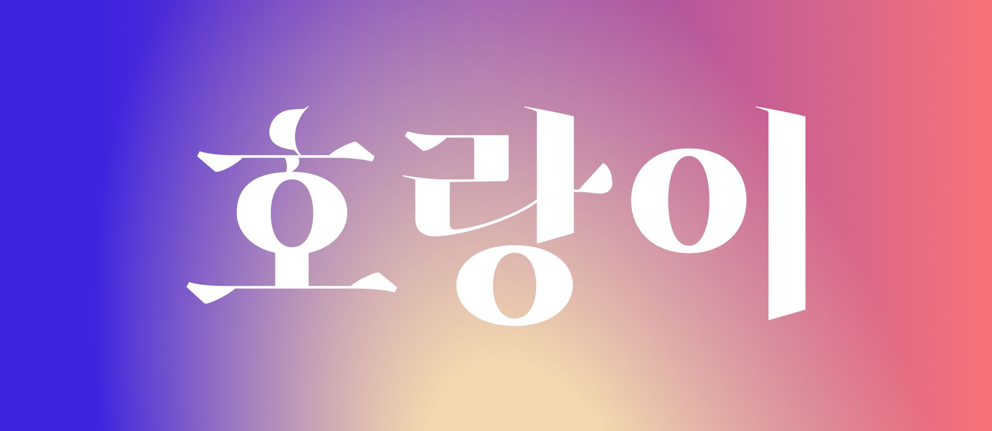
This whole adventure has included several steps which pushed us way out of our comfort zone. The first was taking the decision to undertake the development of the website ourselves (using Vue.js)), a challenge that required us to learn the framework and also dive deep into the world of JavaScript. We then chose to include over 40 of our projects as type examples - perhaps this seems straightforward, but our portfolio is hugely diverse in terms of character set, features, and style, so it was not a simple task! As if things weren't hard enough already, towards the end of the website build we created a simple word equivalence for each of these projects in Korean. Finally, we collaborated with a team of 3D motion designers to create animations for the website.
So, why bother to tell you about our website build? Because it perfectly demonstrates our core philosophy – that it is necessary to embrace a multi-disciplinary approach to type design.
What does that approach look like?
We believe that beyond the process of sketching or research, the future of typography actually lies in creating a deeper version of a font.
As we create our visuals we don't just consider the final use; our goal is not simply to produce a 'tool' removed from a visual universe but to sculpt a vision with it.
We also strive to eliminate anything which could lead to disconnection. In order to make all this a reality, our working process uses what we call a 'triple direction funnel': drawing, prototyping, adjustment.
By drawing, we mean this in every sense of the word, with pen and paper or on screen using vector tools.
Prototyping is harder to describe as it can involve a range of activities and is rarely the same for any two projects, but essentially we try to move as fast as possible onto applications such as Figma, Illustrator, After Effects, Cinema 4D, Unity to see the typeface or fonts in action, which will give us an idea of the universe that the typeface can potentially live in. Responding to this, we create and test hypotheses. This is when we reach the adjustment phase, where we deconstruct our work and go right back to the drawing phase with new inputs! These three distinctive parts of the design process lead from and to each other in a very organic way - it looks a lot like an 'agile process', and that might actually be the closest thing to the way we operate.
We define this kind of engaged process as a merging of typography and branding.
How is lo-ol different?
Typefaces and the technologies used to bring them to life on screen are already incredibly advanced and have been mastered by many designers, but we've made the decision to inject strong personalities, into our type projects. However, we are trying to step away, as far as possible, from projects in which the designer's personality enters into the work – we want to move from a story centered on the human, to a strong narrative and visual vocabulary coming from the typeface. As humans, our stories and memories change, evolve, and shape moments in time, and we create our typefaces with the belief that they too will grow over time as their story becomes more and more defined.
Another of our aims is to contextualize our projects more than ever before – not just through design disciplines like branding, editorial, UI and UX, but through history, geography, and politics. We reject the received wisdom of the 'neutrality' of a font as a tool. Fundamentally, of course, fonts have always been and will continue to be tools, but this does not mean they must disappear in service of a wider graphic experience. We see a future where a font can be a stronger and more engaged set of letters and a typeface can have a strong sense of action.
Not just action, but also interaction, as the variable font has opened up a universe still waiting to be fully explored! Being awakened to this gigantic digital playground has pushed us to consider fonts as moving matter: whether we're thinking about weight, width, slant, serif, stencil, contrast, or anything else related to shape, variable fonts will give more meaning to alphabets and scripts. Moreover, by taking advantage of the way a user behaves and interacts with a typeface, we can bring it into a brand new online world: whether manipulating a computer with a mouse and a keyboard, or on a device using a finger to navigate, we want to embrace each moment as an opportunity for our typeface to thrive.
The future, for us, is clearly about variable fonts, but there is a counterpart that we consider just as important: multi script. Currently, we are working with Latin-based languages and Hangeul - the Korean alphabet. However, we hope to develop our projects with additional scripts and empower each individually. To put it another way: we intend to tell a story through the typeface and let every script interpret it, and by doing so our aim is to keep the authentic nature of a language and its historical context.
We hope that our website gives you a glimpse of a future where type design fully embraces digital. Of course, this is just the beginning, and we are just two explorers finding our way in a new world of type, deeply passionate about creating a new type family. We believe that our website demonstrates the passion we have for our work, through typefaces, work in progress, and experimentation. Going forward, we will continue our prototyping processes, explore more languages and graphic territories, and transpose our new family of fonts into interfaces, layouts, and visual universes. You can browse through the project here: lo-ol.design
What do you mean by...
Agile is a process based on the idea that no project is perfect in its brief, but needs space to breathe and evolve as it becomes reality. In concrete terms, it is a way of working cyclically through phases from design, development, testing, accumulating learning, and acting on it. Most of the time, these working patterns will include areas of expertise including strategist, designer and developer. However, in recent years agile process has become more widely used, for a range of different projects. In the case of type design (and especially our project at lo-ol), this includes a phase where multiple potential 'masters' are designed and developed. This is followed by a building and testing phase on different platforms such as a website, video or app, to learn what kind of visual and interactive universe the typeface exists in. From this point on, we observe, take notes and establish design hypotheses, which then dictate the next stages of the project, leading to further design, prototype and observation.
The technical principles of variable fonts are quite recent, but the theory behind it all is much older. What we mean by 'variable' in this context is simply a value on an axis (a point between 10 and 100) that triggers a change to a shape. Where it becomes more complicated is that a letter drawn on computer is composed of several points which may have interdependent locations. A variable font is a group of letters, working together as a font, which have one or many counterparts on an axis that can dynamically and smoothly pass from one value to another, in harmony, creating a symbiotic visual system. All the points, and the direction they take, define not only the static position (the master) but also virtual (or potential) instances (or positions). This leads to infinite possible combinations of weights, width, contrast, details, serifs and so much more!
The word script is the perfect one to describe a system of writing associated to one or more world languages. In Europe today, Latin dominates, but the Greek script is also used on our continent, and, close by, we coexist with the Cyrillic, Hebrew and Arabic alphabets. So many scripts: so much visual territory to explore! However, at lo-ol, we currently focus on two: Latin and Hangeul (the script used in Korea). The difference between these two is very visible and instantly recognizable. However, both are deeply rooted in history, both have lived through evolution, forced or spontaneous, and both have been contextualized. Clearly, our goal is not to attempt a hybridization of the two, uprooting the culture behind them and creating some sort of Frankenstein typeface (the 'Frankentype', if you will). Quite the reverse: in our 'bi-scriptual' projects, we extract the story behind the typeface to create an appropriate and unique font for each script – and as obvious as it might sound, the first requirement is that the font is comfortably legible by anyone able to read one of the languages. We do not mash culture, we try to be an oscillating expression of language, and an extension of a script's own nature.