Custom made fonts
Since there are so many typefaces, or fonts, available both free and for a price, you may wonder: why do I need a custom typeface?
Why do I need a custom typeface? What do I gain from creating an individual typeface for my brand?
Like every question involving brand strategy in a global and digital environment, the answer is complex. Here, we offer you our thoughts on the matter.
The range of typefaces designed by talented people is growing week by week. The variety of shapes, concepts and intended usages is also a matter of constant discussion and growth. With having that in mind, it's interesting to open the conversation.
What do I gain from creating a typeface for my brand?
Like every strategy in branding, creating an original typeface gives you full control of the structure of your project. From understanding your audience to building the future message of your brand, you can collaborate with a type designer to deliver the right message across your entire marketing channel. The majority of your customer-facing communication will pass through written text, whether individual words, sentences or slogans. So when they encounter your brand, the first thing many of your potential clients will see is a group of shapes – a group of letters. Having a custom typeface gives you unlimited space to transmit a message that is carved into your brand image.
Why do I need a custom typeface?
Let's take the digital sphere as a case in point. The last 8-10 years have seen a massive increase of mobile-based information channels. While other larger formats give more opportunity to use a wider range of media like photographs, movies, and stores and events can offer physical experiences, the mobile is quite limited in terms of media formats. However, its limitations mean that it’s an open space for a different kind of visual interaction with a brand. This is where your custom typeface comes in. By drawing and building a type family that can express the different messages of your product or service, you can create a powerful relationship with your audience.
New tools
These last 3-4 years, technology has also given us access to more motion-oriented communication and to a new feature called "variable". With this technology, you can create more dynamic aspects to any kind of text, words, textual expression or interaction.
Tools for type design
The process of designing a custom project
Our studio, our practice
The most interesting aspect of a brand lives in its strategic core. We believe that a custom typeface is not a final touch that comes through production at the end of any branding project; it’s part of the core expression of the brand’s ideals. Building the concept and the shapes behind your future typeface means that we take into account both symbolic and functional considerations. We ally the image projected by your brand and the context in which the future product will be used.
Language Span
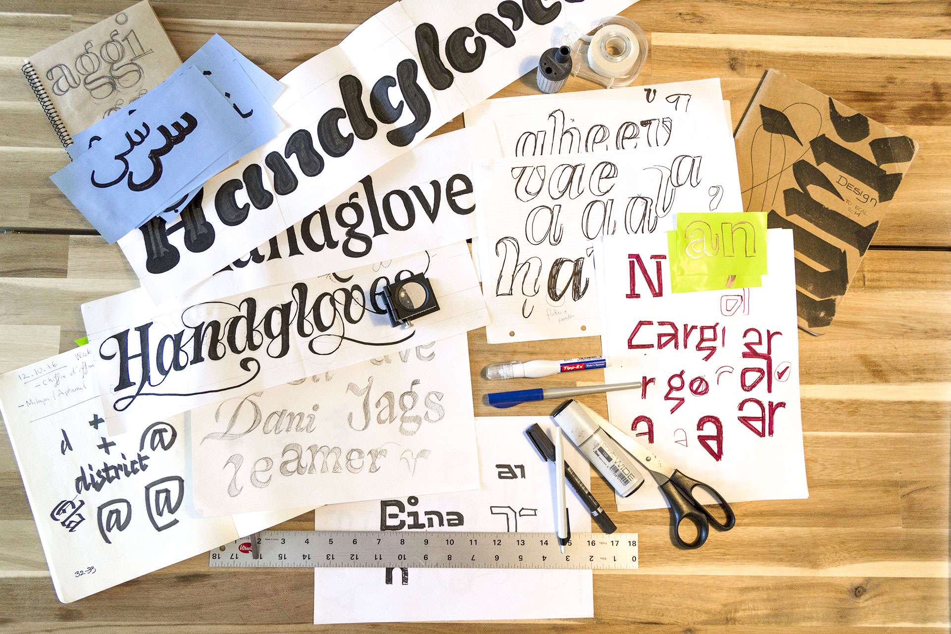
Our skills are oriented on the Latin & Hangeul (Korean) alphabets. We gather samples and research from archives and specimens, with more unique research made through sketches, including the use of different writing tools. This analog period gives us the ability to shape a project with a strong sense of purpose rather than it simply being an exercise of skills.
Our competencies and interest area is also strongly oriented toward multi-script design. We create typefaces and fonts that work in both the Hangeul (Korean) and Latin script. Through typefaces, we form cultural bonds and extend cultural boundaries. We hope to continue to build type projects that bring these two cultural worlds together.
Variables axis
As we push a project forward, we use the latest digital tools to build families and font in order to align with the latest standards. On any custom font or type family project, we also offer our experience with variable fonts, color fonts and opentype features that go beyond the standard usages.
Design is a conversation
We are available to talk via video call in order to understand your needs and objectives. Don't hesitate to contact us at info@lo-ol.design
The Hyundai "Happiness Sans" (Latin)
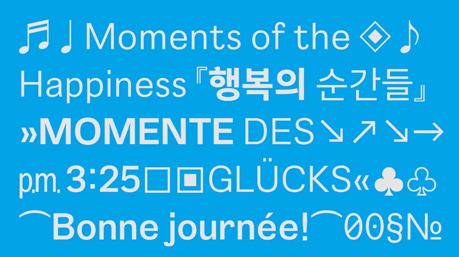
In collaboration with AG Typography Institute, we developed "Happiness Sans", a typeface for the brand identity of The Hyundai Department Store in South Korea. lo-ol type studio took charge of the Latin part.
Happiness Sans is at the core of the brand's identity. It is a typeface with a bright and cheerful visual expression. It also possesses a variable font, which transform it into an powerful tool for digital environments. The typeface extends to two variable axis: the weight axis and the optical size axis.
Hangeul typefaces with a fixed width have the most stable structure. The tip of the stroke is neat and the seam is smooth. The title font of Hangeul is characterized by a cheerful ascending curve of [ㅅ] and an energetic apex of [ㅎ].
In line with the modern structure of Hangeul, the Latin alphabet was designed by referring to the structure and shape of the Early Grotesque. We designed Latin to visually match with the Hangeul in size. This made the lines stable when using the Hangeul and Latin alphabets together.
To use numbers in any circumstances, they are drawn with both variable width and fixed width. [0], [1], [2], and [7] are made with various styles sets.
__
Copyright © The Hyundai department store, AG Typography Institute, lo-ol type studio
1The Hyundai project
Naver "Maru Buri" (Latin)
Naver, Naver Cultural Foundation, and AG Typography Institute released the "Maru Buri" type family. The "Maru Project" explores the genealogy of the Hangeul typeface from the birth of Hangeul to the appearance of the current Hangeul typefaces. This version embraces new media environments.
The "Maru Buri" is a serif style typeface (serif = buri) for text layouts. It brings warmth to the screen and offers various visual choices in digital media. The design was developed using Choi Jeong-ho's Buri style series. The basis of the text typeface for print and the font were created in order to achieve youthful, dignified and bright visual direction.
lo-ol type studio took charge of the Latin part. The design of Maru Buri Latin is based on both the Gerald style and the Venetian style, which are the origins of the printed type. In other words, just as Hangeul continues Choi Jeong-ho's Buri style, the Roman alphabet also carries on with history.
The "Maru Buri family" released its final version in 2021.
__
Copyright © Naver, AG Typography Institute, lo-ol type studio
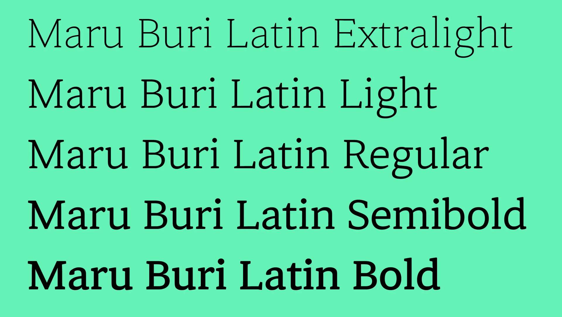
1Naver "Maru Buri" Latin
"Proxima Nova Hangeul" (Hangeul)
We have created the Hangeul version of Mark Simonson Studio's masterpiece, Proxima Nova, titled "Proxima Nova Hangeul".
The main focus of the design for Proxima Nova Hangeul was archieving a balance between Grotesk and Geometric forms, as intended in original. Proxima Nova Hangeul delivers precisely this—maintaining the signature look of the original while respecting Korean typography’s unique structural needs. Eight weights, meticulously adjusted for perfect visual harmony between Latin and Hangeul scripts.
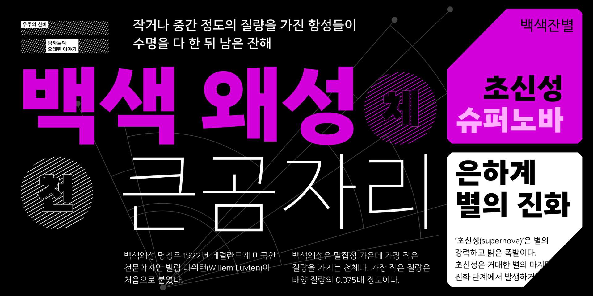
1Proxima Nova Hangeul
Whisper & Giants (Latin)
"Whisper, Giant, and Signal" is one of the three member of the Whisper & Giants identity. The three style works around a common skeleton core and some distinct features. The family is working around three different specific cuts: one humanist serif, "Giant", for the title and headlines; a second one, "Signal", a sans-serif grotesk for longer text sharing the same terminal system; and finally, "Whisper", a monospace strongly influenced by the shapes and dynamism of the lineale grotesk.
This design system has been created for the company Whisper and Giants. As design researchers, anthropologists and service designers, they tackle different subjects on different level. The font project gave them the toolbox necessary to use them on all of their different platform such as their website, their applications and all of their communication support.
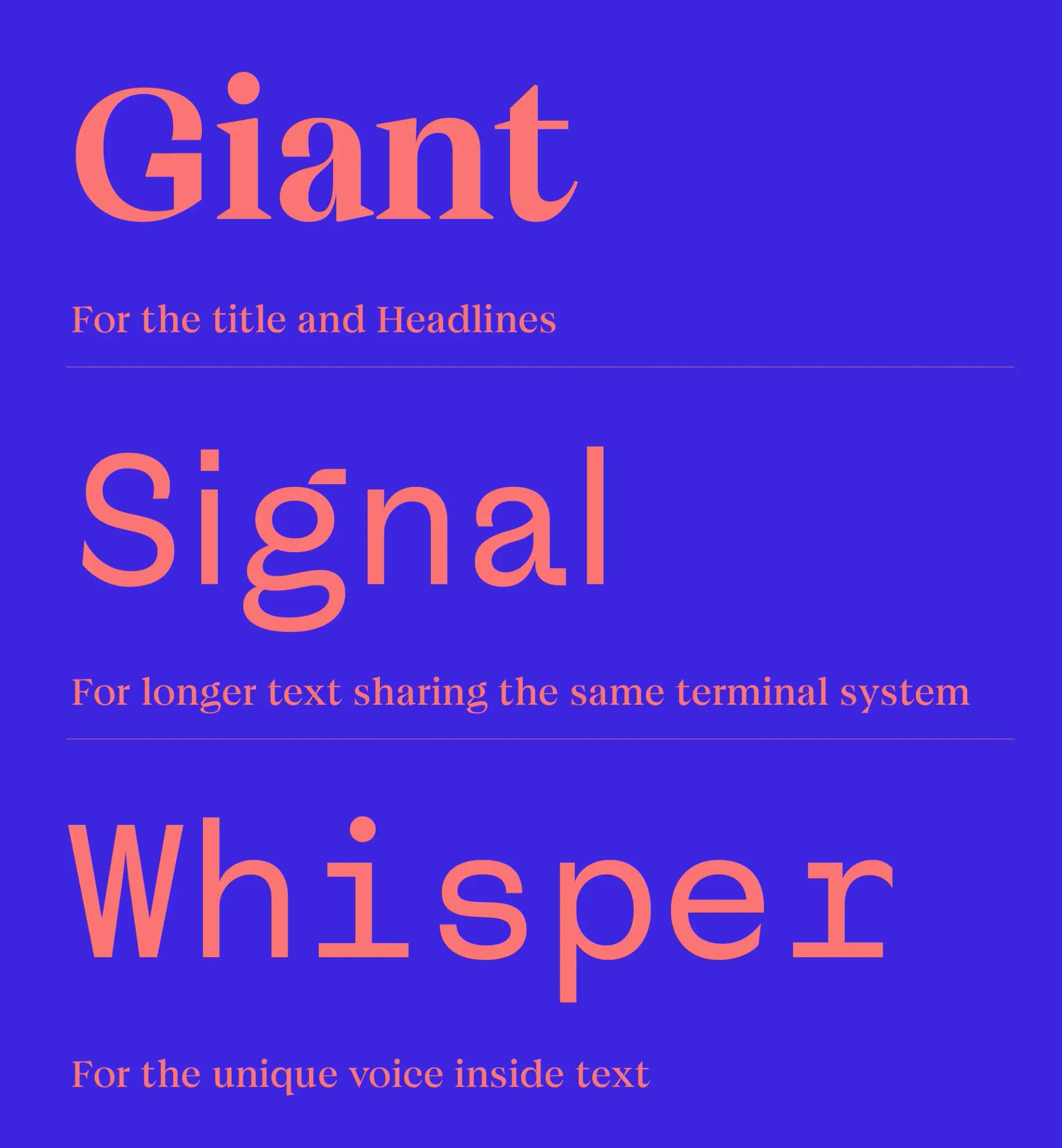
1Examples of usage
Doran (Latin)
"Doran" is a typeface commissioned by Doran Sou, a bed and house supplies based in Geneva. The font reflects the harmonious and exciting universe of dreams and sleeping time.
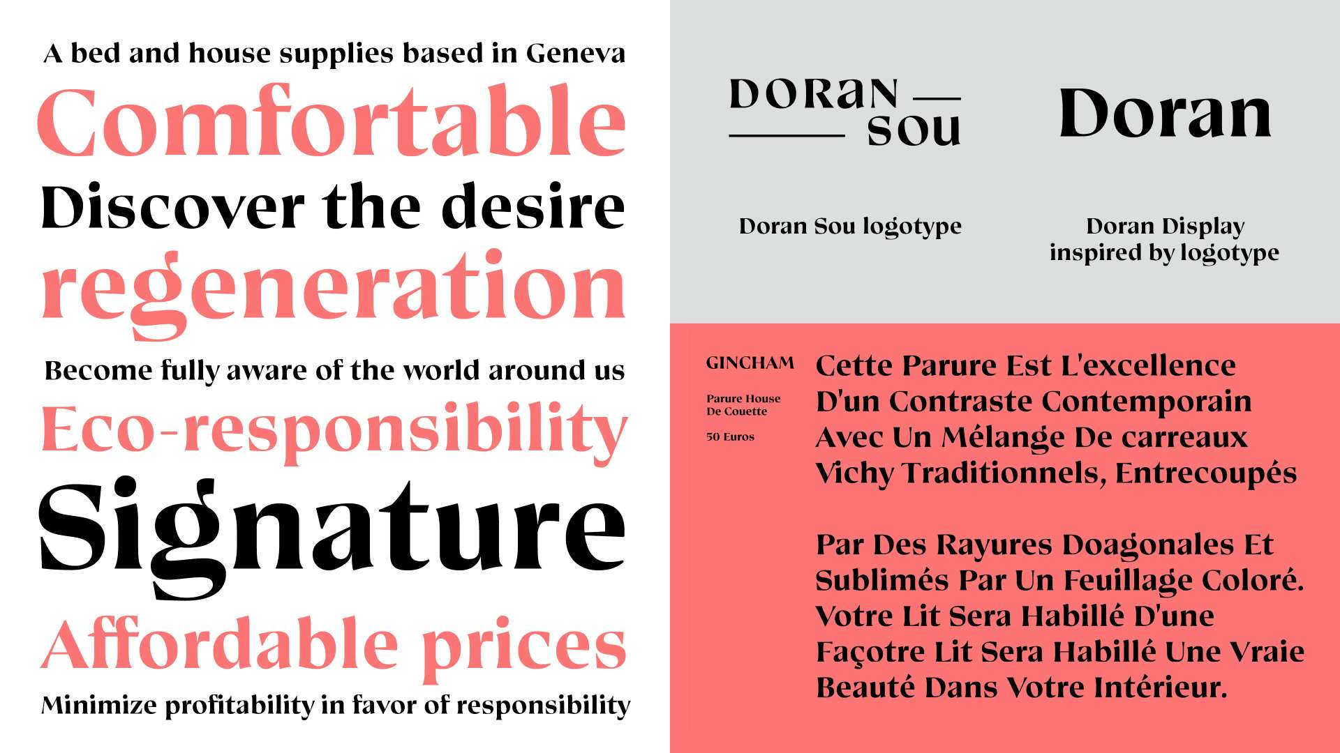
1Doran for house supplies, Doran Sou
Tamburins (Latin, Logotype)
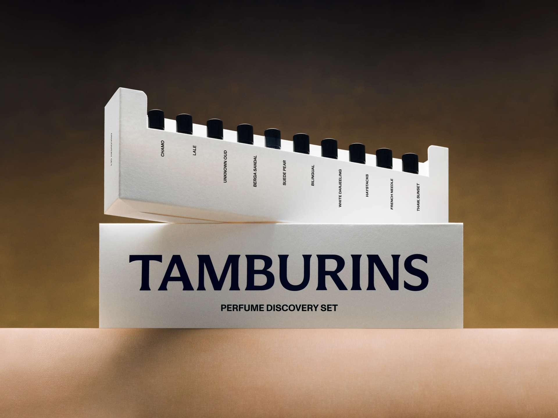
We have collaborated with Tamburins, a Korean cosmetic brand for their new logo and identity for their perfume line.
__
Copyright © Tamburins
