Hangeul
The script
Hangeul is the name given to the writing script in Korea. It was created by the Great King Sejong and his team in 1443.
What is hangeul?
While in the west we have seen some slow alterations over time to our alphabet through habits and progressive changes, in 1443 the Korean king Saejong took it upon himself to create a writing method that would give access to reading to his population.
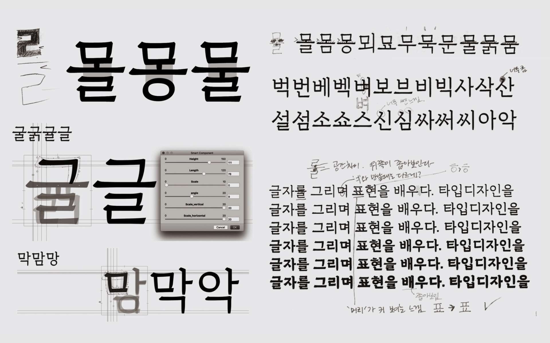
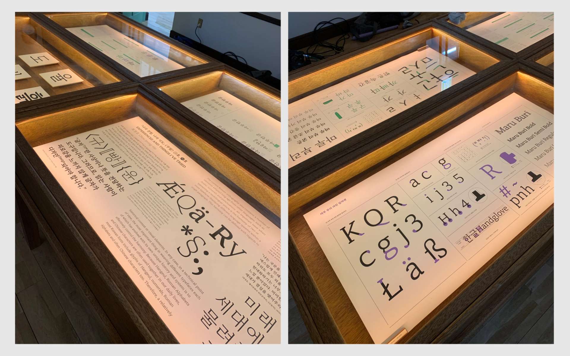
The Korean writing system, Hangeul, works on a system with vowels and consonants. Like building blocks, vowels such as a, o, yo, u, yu, can be combined with consonants in different layouts. If we look closely at the methods of building these keys (one character made of different vowels and consonants), each letter is parametric. It means that each letter will have a different proportion according to the context in which it is located.
Why have such a parametric system? In the Korean language, there are many different sounds and in any language, there are a huge number of words and expressions. This means that you need a detailed system to cover a significant number of potential combinations. In total, a Hangeul typeface can contain up to 11'172 single characters.
The Hangeul Market
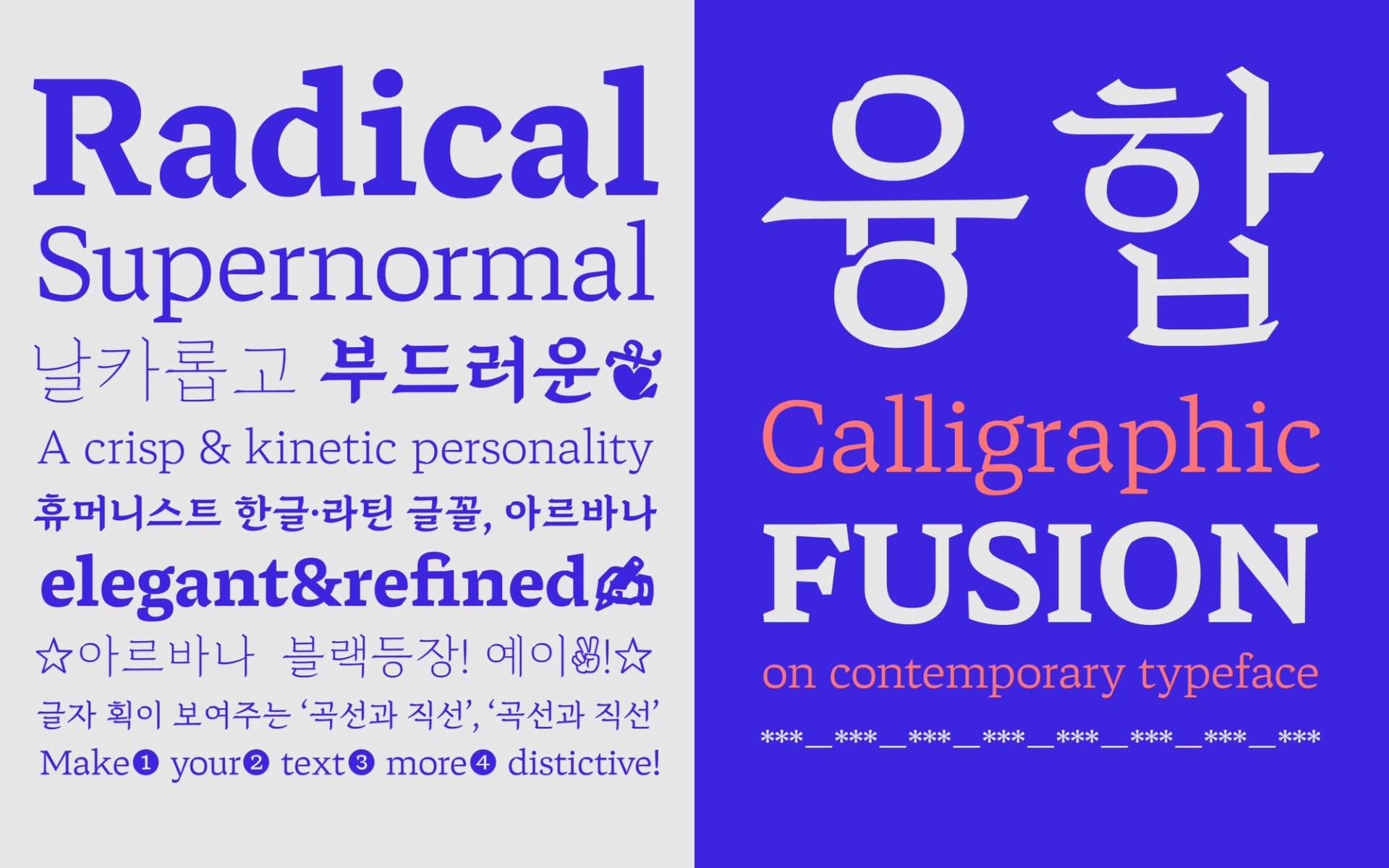
There are tons of Hangeul typefaces in the Hangeul font market. Like Latin typefaces, there are various shapes, such as serifs, sans-serifs, and even very playful ones. With the continuing development of font tools, the Hangeul typeface market is rapidly becoming more dynamic.
In the past, major font companies were in charge of developing fonts based on the classic ‘Myeongjo’[1] style or ‘Gothic’[2] style. However, in 2010, the number of typefaces made by independent designers and small type companies have gradually increased, in a trend similar to the Latin alphabet.
It is difficult to define the trend of Hangeul typeface development in one word, but there seem to be three tendencies in general. First of all, the so-called ‘Revival’ is a method of reproducing and interpreting the past in a modern way. Second, there is a method that is inspired by the flow of scripts from other cultures such as Latin or Kanji. And, finally, a display direction that adapts the alphabet towards the shape of a signboard or a specific daily object.
First Method
The first method has traditionally been pursued under the existing education system. ‘Revival’ takes an almost archaeological approach, examining and studying the unique history of Hangeul.
Second Method
The second approach is a phenomenon that occurred because the typography system of the Western world had a great influence on education in Korea, particularly in the second half of the twentieth century. In institutional settings, graphic design education is mostly based on the Western system. Therefore, in general, the structure of modern Hangeul typography contains many traces of Latin typography.
The first approach is meaningful in that it is a way to learn more about and preserve the history of Hangeul. On the other hand, this approach also makes designers quite conservative. There is a limit to contemplating new expressions and creation.
The second approach creates new forms and ideas by crafting Hangeul with elements that have not been encountered in the existing culture. In particular, in modern Korean society, where Hangeul and Latin are mixed everywhere, this approach seems to fit well. However, taken too far, it undermines the unique beauty and the authenticity of Hangeul, even to the point of reducing the reading capacity of native readers.
Third Method
The third approach is to find shapes from old signs or handwritten letters and express them in the designer's own way. This method retains the original shape of the letters, so it is easy to access for introductory typeface design. It is not an in-depth research method like the first method, but it could be seen as a part of the revival approach in some way.
In my case, ironically I first entered the field of typeface design through the Latin practice. Since then, I’ve drawn on the inspiration I’ve found through my work and crafted it into Hangeul. The first result is ‘Arvana’.
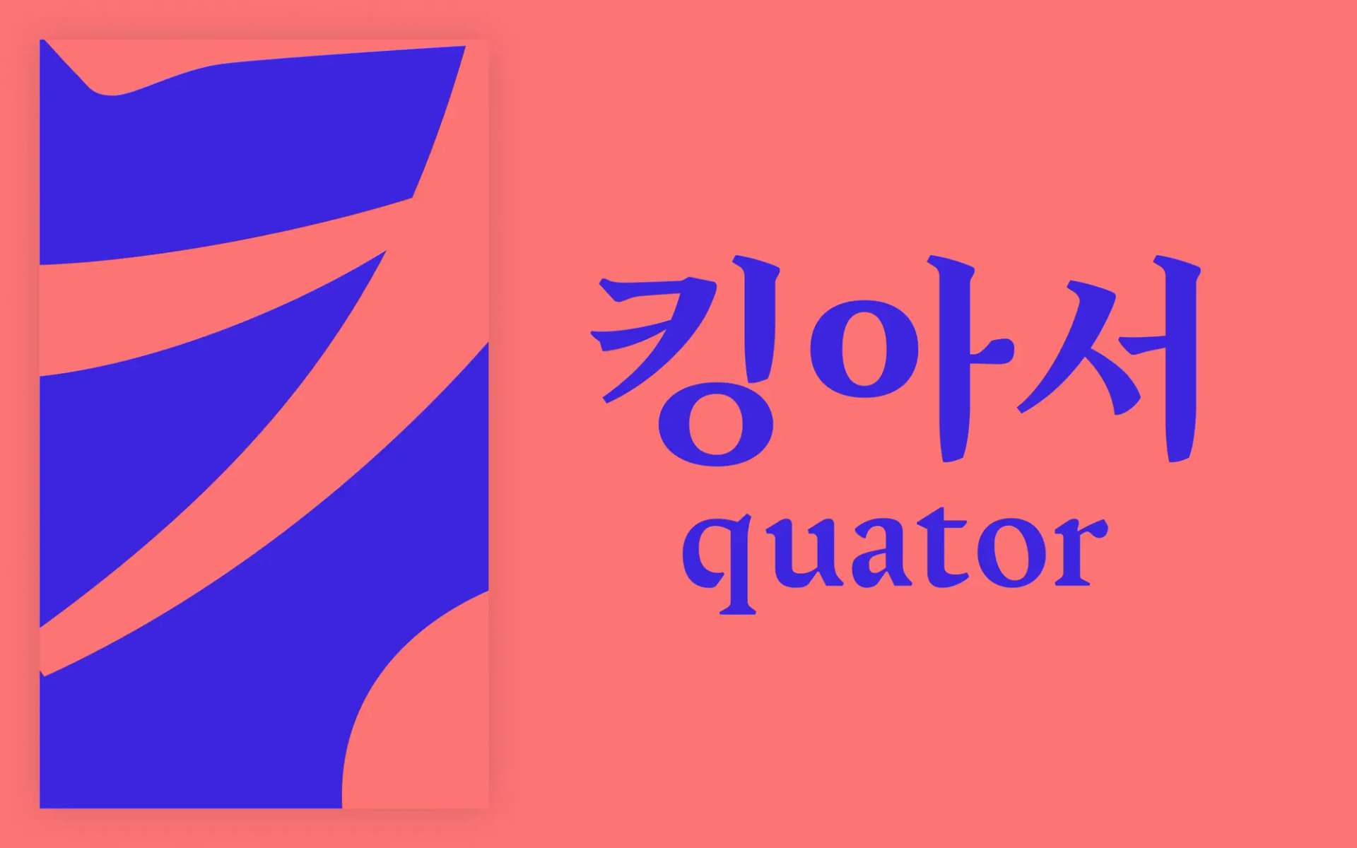
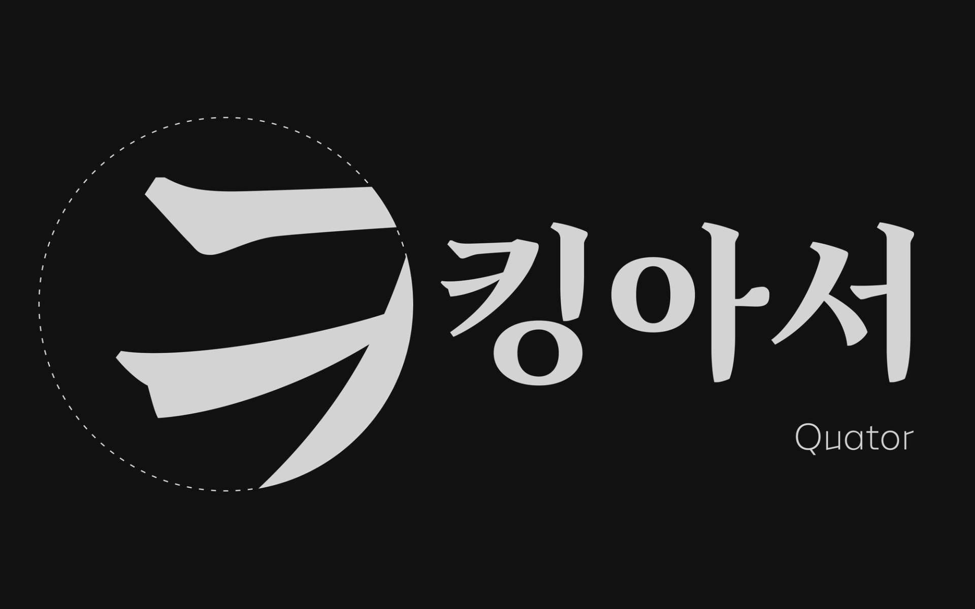
1Some example of Hangeul
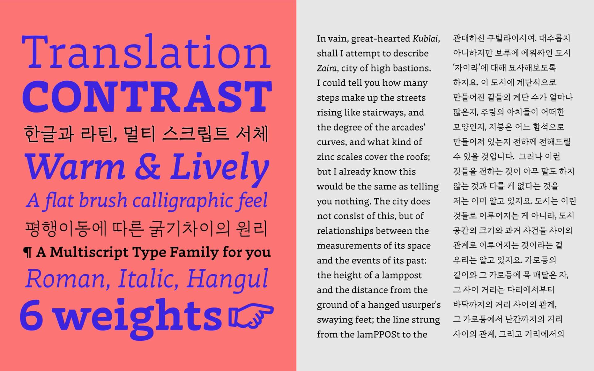
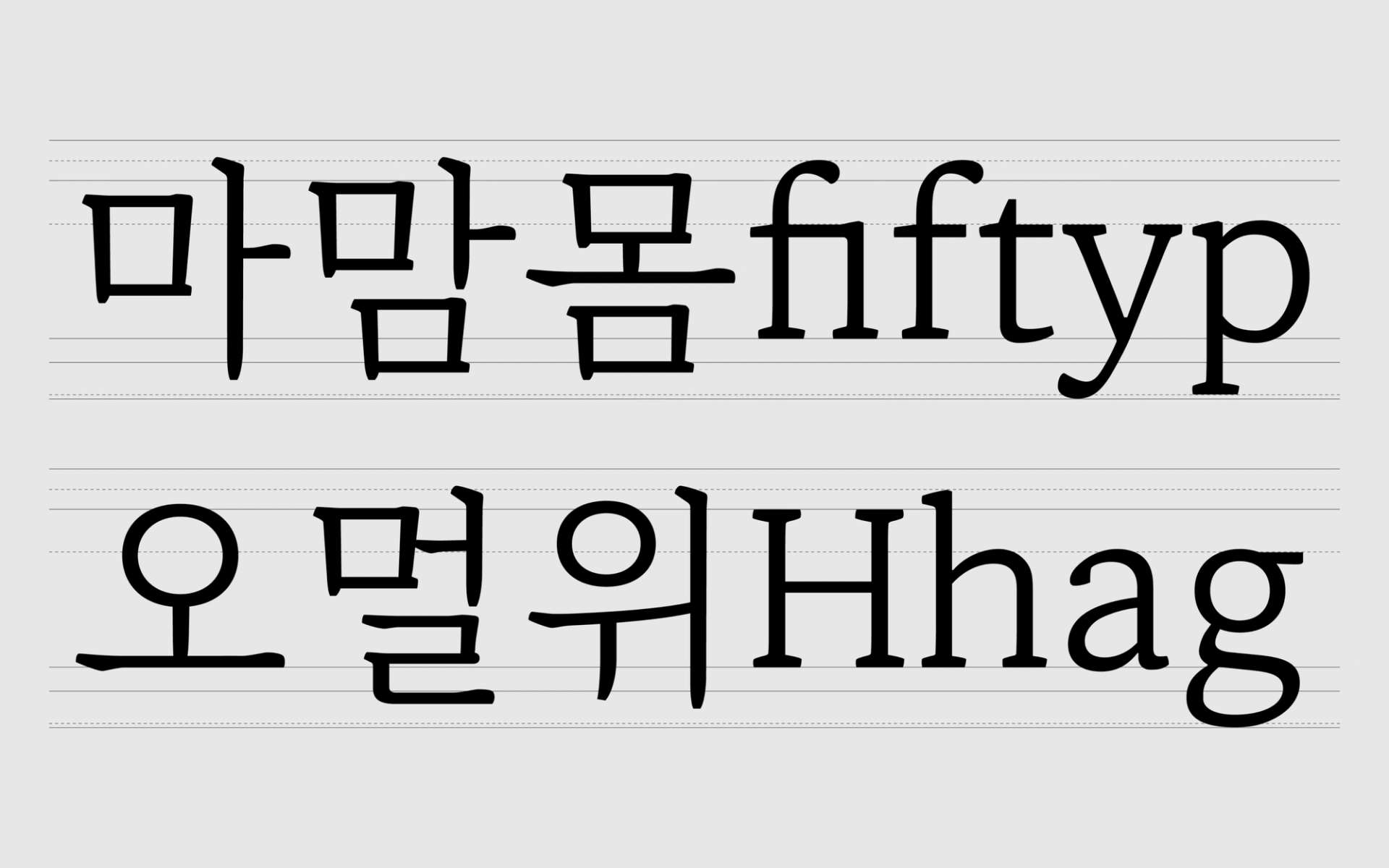
Hangeul & Latin
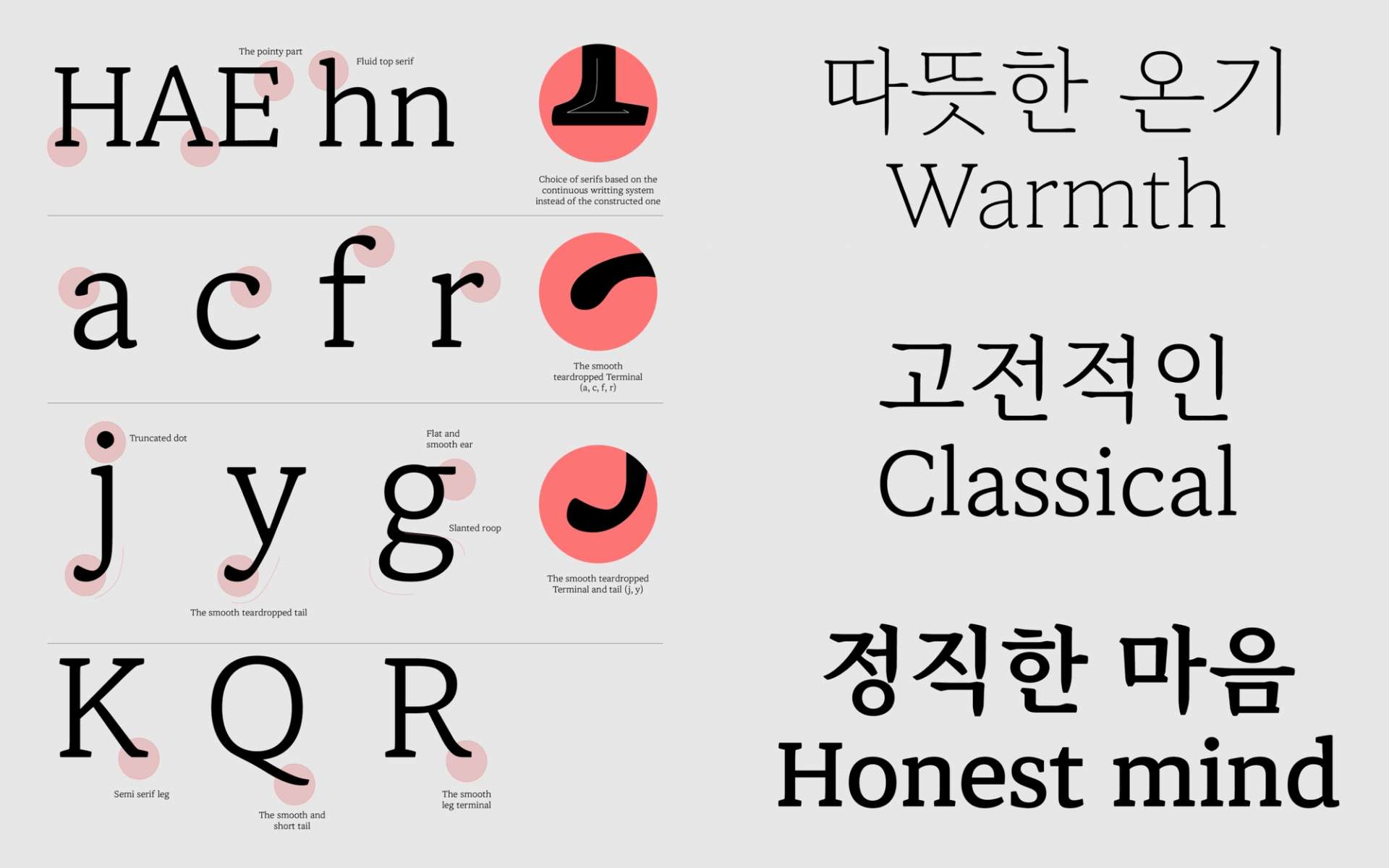
I was attracted to the morphological similarities and differences between Hangeul and Latin; in fact, this point of interest is the reason I started designing typefaces. When I first started working with Latin, I felt a certain kind of resistance. I didn't like the traditional approach followed in college education. So it seems that the second approach was more suited to my own inclinations. It was good to find a new formal approach that was different from the existing ones. But I set one rule: when it came to grafting, I decided to maintain the basic flow of lines and the original construction of Hangeul as much as possible.
The method of morphological fusion is well explained in Gerrit Noordzij's stroke theory. Most of my work is inspired by it. Of course, Noordzij's theory is quite Latin-centric, however, the form of translation and expansion of strokes according to writing exists in any alphabet. Based on this writing theory, I have mainly developed typefaces by adding the designer's personal interpretation.
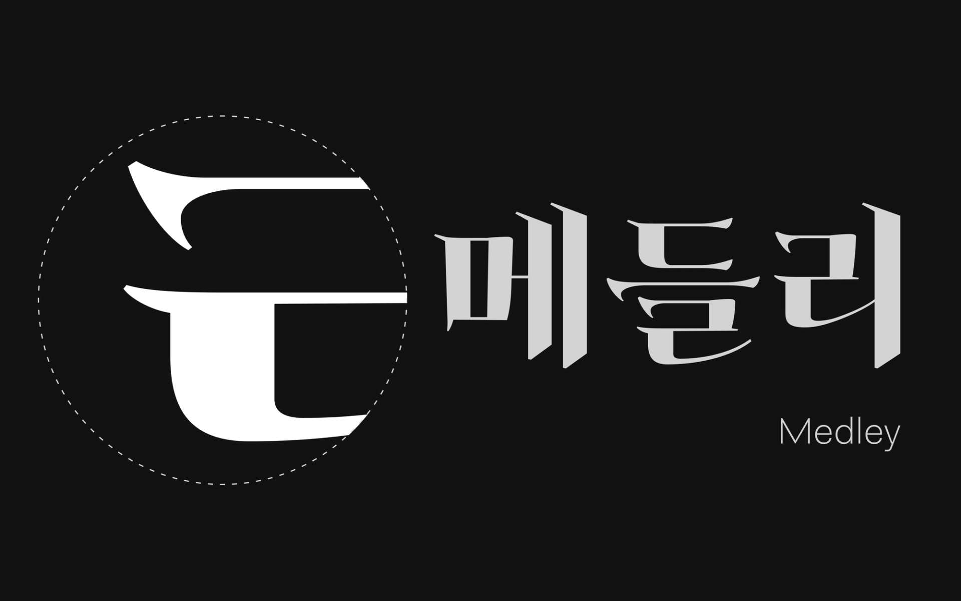
1More exploration from Latin
Arvana, Areon
My first typeface, Arvana was my first attempt to explore a morphological fusion of Hangeul and Latin, Arvana was inspired by the Latin writing method using the broad nib pen. [link to futurefonts] [link to Agfont]
The second, Areon was a project which began by exploring the relationship between Latin and Hangeul, and the subtle side of inverted and low contrast. [link to Typemedia2018] [link to Morisawa]
These two projects had a huge influence on me in designing Hangeul and Latin fonts; they served as a great starting point for me to determine my future design direction.
Not only that, but also it was good practice for Latin work. In the case of Arvana, two people collaborated together, and Areon Latin was exclusively drawn by myself. This work also made us think about how to match Hangeul together.
Maru Buri Latin
So that is why a good comprehension of both the Hangeul and Latin typographic ecosystems is truly necessary when creating custom types. One of the custom projects I am currently working on is ‘Naver Maru Buri’. [link to Naver Maru Buri]
This project started through the collaboration between the Ag Typography Institute, Nohtype, and the biggest Korean IT company, Naver. I am contributing to the Latin part of Maru Buri. The process of correcting the shape and the position of Latin according to Hangeul is possible only if you know the structure of Hangeul –it's very different from drawing a Latin solo typeface. For example, accommodating for the lower position of the Latin baseline, a much thinner line, Hangeul-only numerals, and so on.
Multi-script
All the typefaces of lo-ol type are the result of exploration between familiar and unfamiliar shapes.
While continuing the existing customs, we also transform the internal order. This is the design principle we are pursuing.
With this principle, lo-ol will continue to strive to develop fresh multi-script fonts.
* lo-ol Hangeul Retail typefaces (2023): Arvana, Giparan, Ortank Hangeul Text & Display
Know more
A term used to refer to serif style typeface. Some people call "Myeongjo", "Batang" or "Buri".
A term used to refer to san-serif style typeface. Some people call "Gothic", "Dodum" or "MinBuri".
Hangul Jamo(=Jamo) is any of the 24 building blocks of the Korean (Hangeul) alphabet. - Cosonants: ㄱ ㄴ ㄷ ㄹ ㅁ ㅂ ㅅ ㅇ ㅈ ㅊ ㅋ ㅌ ㅍ ㅎ - Vowels: ㅏ ㅑ ㅓ ㅕ ㅗ ㅛ ㅜ ㅠ ㅡ ㅣ
- Choseong(초성): leading consonant - Jungseong(중성): vowel - Jongseong(종성): last consonant
Contact
For technical questions, help or assistance with our fonts, please send us a message to this email address
FAQ
Any question you might have on the fonts, the license or custom fonts are available here
