Optical size, aesthetic vs practicality
As we know, some details are hard to perceive when the scale of what we are looking at becomes small or microscopic. The properties of optical size indicate that there is a context of size in which a set of letters in a font will be read in an optimised way.
In terms of reading, lower contrast fonts are easier (e.g., less tiresome) to read. Here we are talking about the eye and the perception of the letter shape, but what if some details on a screen start to disappear as the single-pixel unit is not able to render? That’s the other advantage of lowering the contrast between the thicker and thinner parts of the letter.
Having more visual matter in these thin parts helps sharpen the image of a letter and therefore the word. We are optically designing a set of letters – a font or a type family – to visually behave as if the font size was much bigger. In this sense, we are more analytical than aesthetical in terms of typography practice.
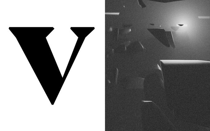
This second part, the aesthetic, is also a way of looking at the topic of optical size. Designers will sometimes create a second style that is more contrasted and expressive for the sake of a different visual image. Having a text version with choices strictly based on readability can also justify having a “display” version for the typeface or type family.
Display, text, or heading might be some of the words that you encounter when it comes to optical sizes. You can think of it as a progressive bar in which you progressively remove weight on the thinner piece to go from ease of readability to a design-based aesthetic.


