Custom vision for type and beyond
No, there is a particular aspect of multifunctionality and "universalism" when a font is birthed. What this means is that most foundries and designers create products that are accessible to a broad audience. Yet, it is true that some companies and brands choose to create unique shapes, fonts, and type families to reflect a unique identity defined by a brand’s strategy.
In this article, we will explore the world of custom fonts. As we do not pretend to hold the one and only truth, we would like to offer you our vision for the future of fonts and typefaces. From hand-tailored custom projects for specific brands to a wider approach for a broader audience, we will introduce you to the processes and platforms that allow us to deliver these custom packages.
Objectives of Custom
Brands such as Nissan, Renault, Google, Microsoft and Apple, for example, all use specific private type families that have been specifically designed. They do this for two main reasons: either to achieve a design and brand strategy objective or to resolve a technical issue unique to their business product or service. The case of Nokia and its typeface Nokia Pure is a great example. It covers many languages, as their target audience is quite broad, and it is designed to work on their mobile OS. At the same time, this new font toolbox helps spread the brand identity throughout their products. However, the two objectives, branding and technical solution, can be a reason on its own but can also be combined in one strategic move. IBM Plex is an excellent example of that. It provides several sets in its type family box, which offer usage specific to an end usage context, such as IBM Plex Mono, comfortable for coding software.
A custom project also essentially gives the creator control over a group of shapes and fonts. Having an art director involved allows for a broader vision of the tool to be built. While it might be reasonable to question why a typeface explicitly designed for a project is superior to one available in a retail store, we need to understand the complete narrative behind the choice of going fully custom. Most of the time, there are secondary reasons beyond the use of distinctive details. The choice of uncommon serifs, specific contrast, specific historical reference, and many other reasons, live inside every choice of a custom project when it is fully drawn in the intent of the brand it will represent.
Custom By Yourself
The downside to these projects offering so much freedom in design conception is their price. In fact, a custom project can be several thousands of dollars or more. However, this price is totally justified as it covers the research done for the client, whether through desk research of historical sources or online, as well as the sketching and hand development of several options.
However, at the same time, these custom projects are more and more prevalent in the market. Some companies have developed specific tools and applications that aim to give full control to the designers. Indeed, these platforms offer frameworks around which designers can play with all factors, such as weight, serif or not, the shape of the serif font, contrast, etc. That kind of Swiss Army tool is quite remarkable and interesting to see in both its technical environment and its visual execution. They are, in fact, pushing the visual designers to cross the type design river and make deeper and more impactful choices.
Too Many Choices, Death to the Choice
However, user experience (UX) practices have brought us an essential element and lesson. Giving a user too many choices is very often a source of stress and diversion. What could be seen on one side as a richness of options might very well be a source of frustration on the other. If we consider the choice of a type family, two factors come into play: trust and time. For the first point, most designers will browse familiar type foundries and design websites that they trust to have the capacity to deliver a functional tool. Rare are those who come back to a store where they have bought a font and had more trouble using it than benefitting from its usage and visual appearance. The second argument, time, is essential too. While we all want, as designers, to deliver the most unique project and satisfy a client’s needs, time remains our ultimate master. Giving the designer ten times the potential options to sort through might not be seen as justifiable in a budget. In addition to that, a lot of designers need to test very quickly and not only build an opinion on the typeface they are testing but also build the visual direction of their project.
Full vs. Targeted, Custom Vision
While we have some projects that are fully customized with decisions tailored at every level of detail, we think that most often targeting and testing aspects of a type family to give a custom angle to the customer is the answer. Don't get us wrong, there are no specific answers that can be magically applied to the whole wide spectrum of type design. The interesting part resides in this duality: what is the territory that needs to be covered by us, and what freedom do we leave to the user and designer.
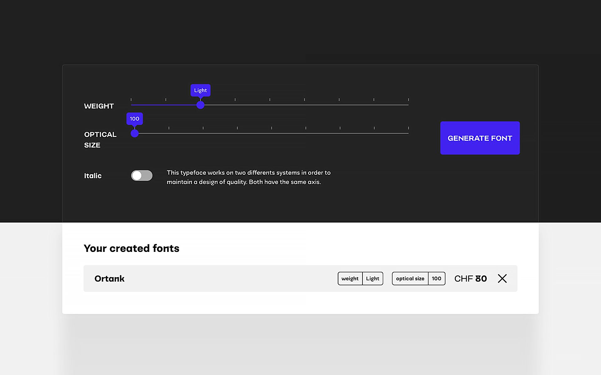
The variable font technology is an amazing advent. But as much as it is great, strong processes need to be put into place when building a custom font generation system. While we give a strong art direction to the core of the font families we draw and produce, we define and develop axes that define the product at a high level. We make it very clear that the goal is not to create a fake makeup layer over a typeface. The goal is really to offer variants of our core fonts to create a tool that completely fits the user's needs.
In order to be clear, we could take the example of several projects we have launched. Lemanic, a serif type family, gives the user full control over the amount of contrast in the generated font. As the user has their end usage in mind, they can determine if the contrast needs to be higher such as when it will be used in a large title or if it will need to be lower because it will be used for large texts. This goes without saying, but the weight axis is a central feature. In the specific case of Lemanic, we do not ask the user to determine the shape of the curved part, the size of the serif, or on which typographic model should followed. We reduce the friction to the minimum here without falling into an artificial process of choice.
These axes of customization are defined early while designing the font family map. The question leading to the creation of this map can go from: What final usage do we see for this family? What are the unique voice and visual expressions of these fonts? What freedoms would be useful to a user? How much choice should be offered concerning weight, width, slant, etc.? So many questions that should never erase the need for strong art direction. We define that as the acceptable space between our expertise of type designer and the necessary space required by every designer to find the right font for their project. In the end, we come from supplier to partner in choosing the customer product.
Instance vs. motion tool
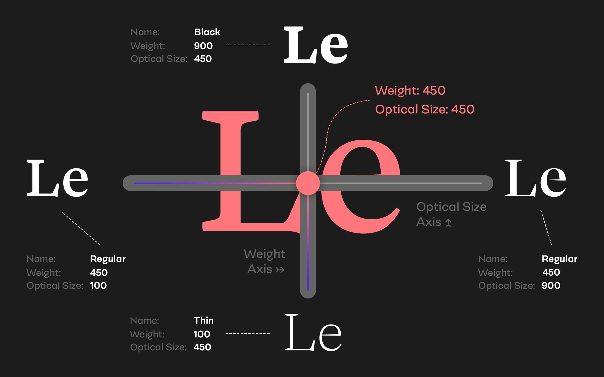
Like every desire to create something new and experimental, there are some potential pitfalls. The most important considering what we have described above and in light of variable fonts, is to not consider the variant between the extreme points. It is not wrong, but we need to be really clear on what is the final usage. If this is due to motion interaction or animation itself, extreme concerns can take over the rest of the structure. In our case, we have to consider that everything that lies between the extremes has to be fully functional, both technically and visually.
If we take the example of a typeface with many axes, let’s call it Noraya, including the width, the weight, and the slant, we need to have a combination that reflects an interesting solution. If we take a semi-condensed medium slanted point, we need to have an interesting solution that brings enough variety without falling into an experimental angle.
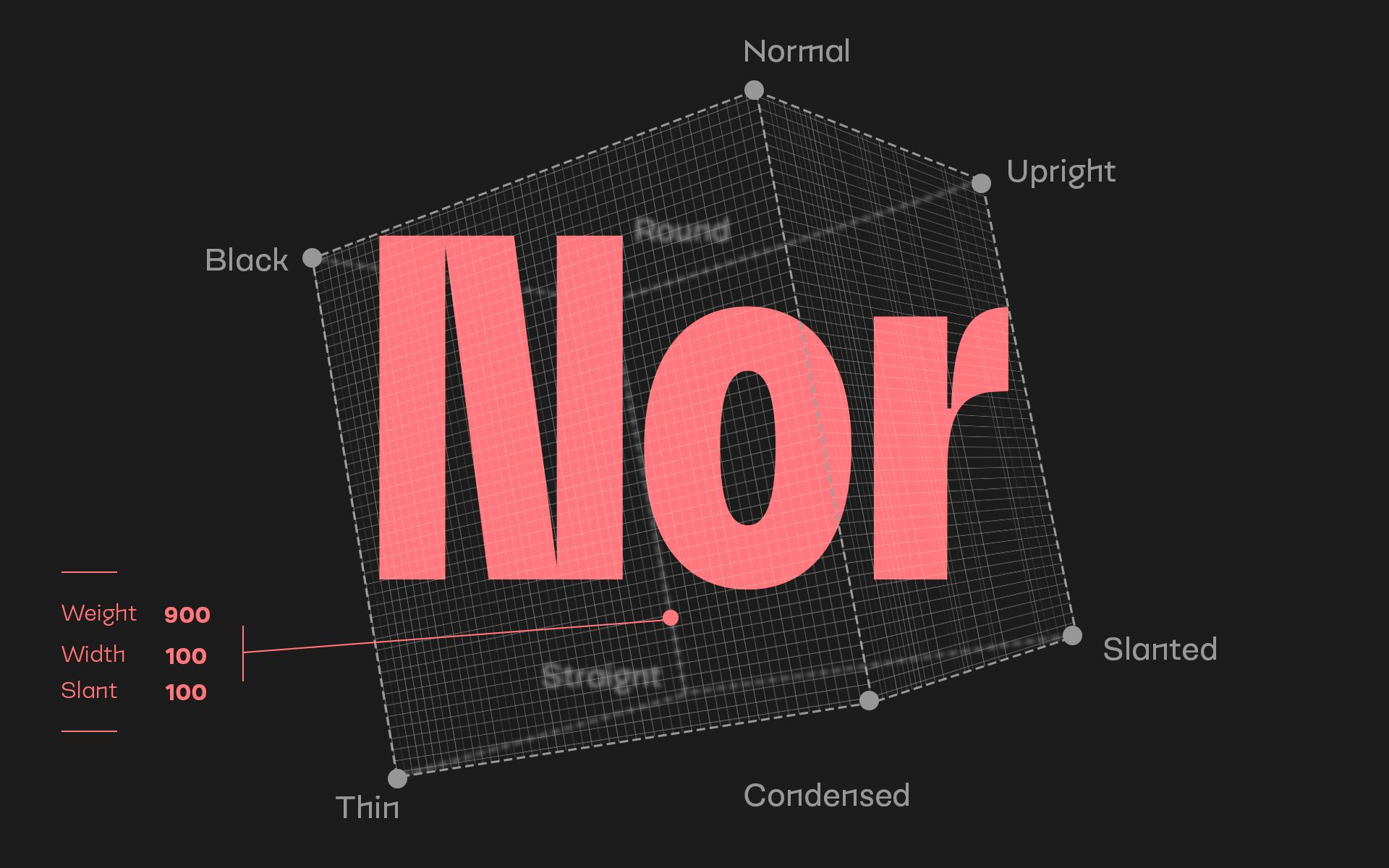
In our case, the custom package with its generated fonts must take full advantage of the multiple axis design universe to trigger a dialogue between our team and our future user.
We do not hold all of the answers on your specific project(s) so let’s co-create a final version that will fit perfectly the support, web or print, on which your work.